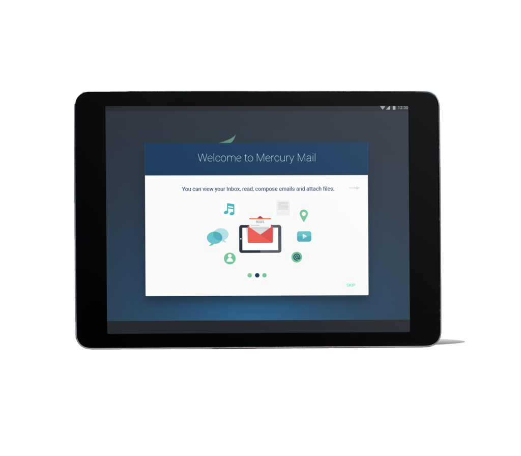
Mercury Mail App
Mail management made easy.
My Role
This project was an assignment for one of my courses in the Multimedia Design and Development Program at Humber College and was made in collaboration with Marta Nikitina. My work involved:
- Initial research;
- Sketching and wireframing;
- High Fidelity mockups;
- Prototyping;
The Challenge
Many people check their email on mobile device, before they read it on their desktop. With today's incessant amount of email marketing, and most of professional communication being done by email, checking inboxes can sometimes be overwhelming. This often means that users have multiple accounts for multiple purposes. It can be great for routing emails that are not important, but it means that there are more accounts to check.
Furthermore, we found from speaking to several users that composing an email on a mobile or tablet device can be highly frustrating. One pain point is the lack of space there is to read and write comfortably.
The Goal
The goal of this project is to make the experience of reading and composing email on tablet, more efficient and comfortable.
Mercury seeks to make checking emails easy by making it easy to merge different email accounts into one easy-to-use application. While also allowing easy navigation between the accounts.
Mercury also seeks to create a more comfortable space to compose and read emails, in which the user can focus solely on the task, without being hindered by lack of space.
The app must:
- Must integrate different email accounts with ease
- Must have easy to use email sorting tools
- Must have a filtering tool
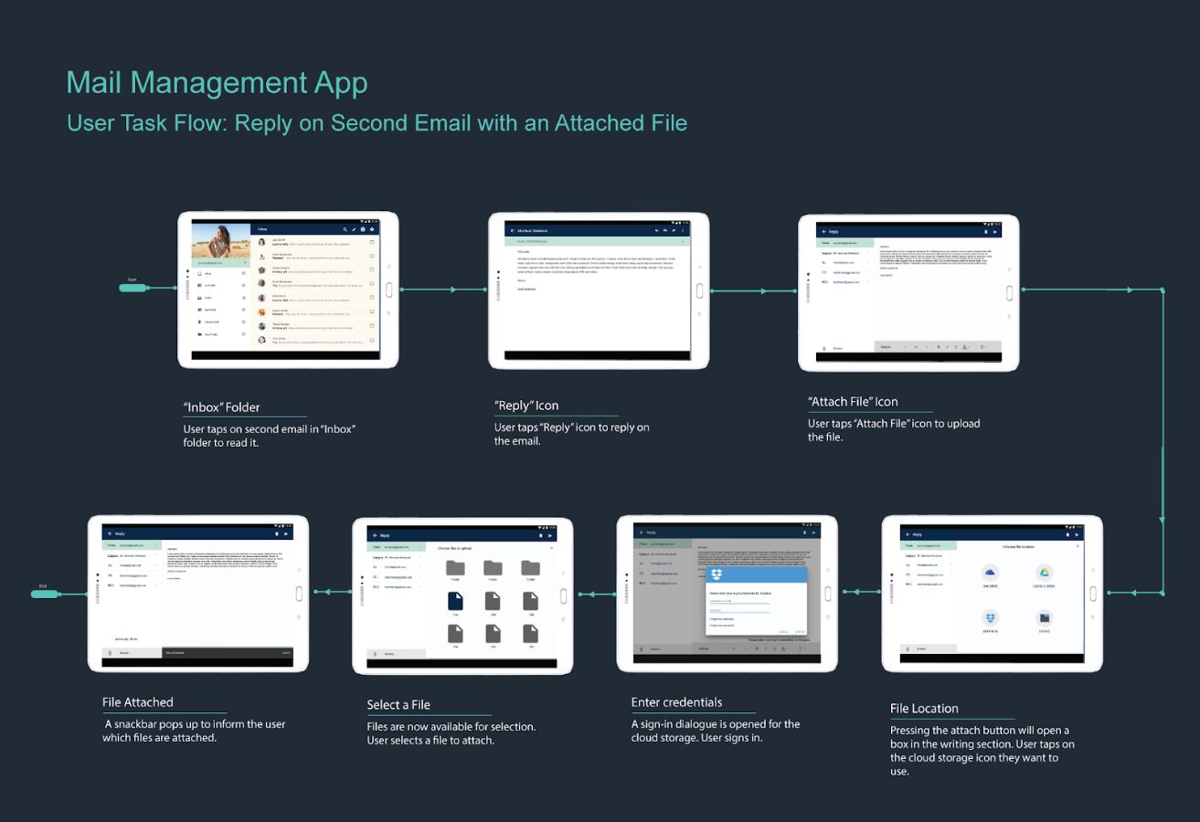
- Must be easy to attach files
- Must provide a comfortable compose/reading experience
The Research
This was my first experience doing design research. We wanted to explore mobile device and email usage trends, as well as hear peoples experiences using mail on a mobile/tablet.
We went through some studies to get usage information and build our personas. Our most valuable information came from surveying our peers.
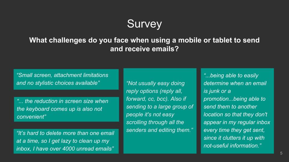
Finding from surveys:
We wanted to know more about people's personal experience with email. We created a survey and sent it out to our peers. Even though the sample was no more than 15 people, we were able to establish some pain points.
Findings from Studies
From the research, we found
49% of Canadians own a tablet, Women are more likely to use their tablet/mobile to go online. They also spend more time using them.
Around 42% of email users check email on a tablet. Users were asked if they checked emails on mobile before checking on the desktop: 40% of people 14-18, 29% of people aged 19-34 and only 8% of people over 67 said always. Meanwhile, 47% of people 14-18, 52% of people aged 19-34 and 35% of people over 67 said sometimes.
This Research we found on HubSpot and is mainly directed at email marketing, but what we learned from this is that many users tend to have multiple email addresses to receive different types of emails.

The Design Process.
Our design was formed with the concepts of easy accessibility. The inbox shows a sidebar, which gives easy access to all folders and accounts.
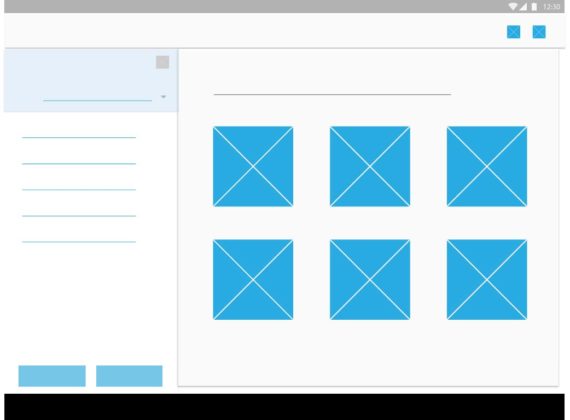
The when composing an email, the screen will have a sidebar for recipient information and attachments. We made this bar retractable so that users would have space to compose more comfortably.
The earliest version of our design included personalized color settings and a calendar. As we started to design, we realized we had to focus on the main functionalities of the app to make a prototype that addressed the main challenges that users were facing.
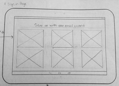
Sign in
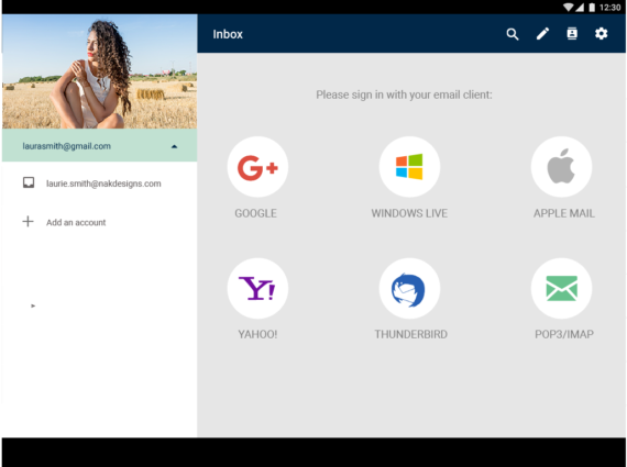
The Sign In Screen was meant to support email from the top email providers such as Google, Outlook, Windows Live, Apple mail, etc.
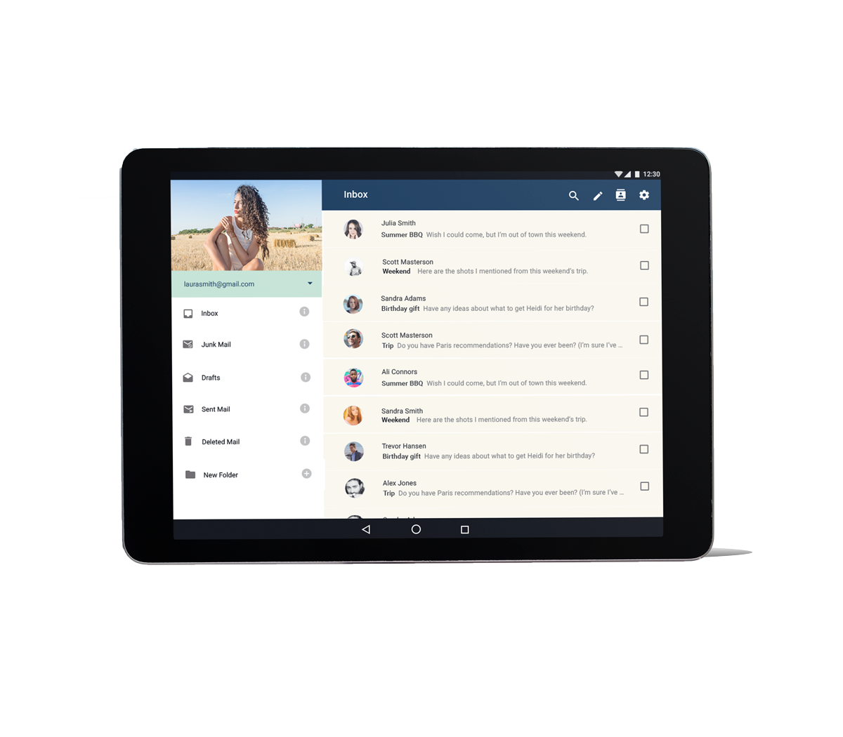
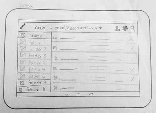
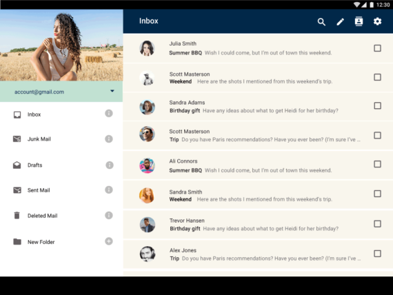
Inbox
The inbox screen originally was meant to have a sidebar that would allow the user to browse emails by folders. It also allowed the email accounts to be toggled using the top bar.
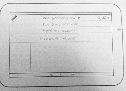
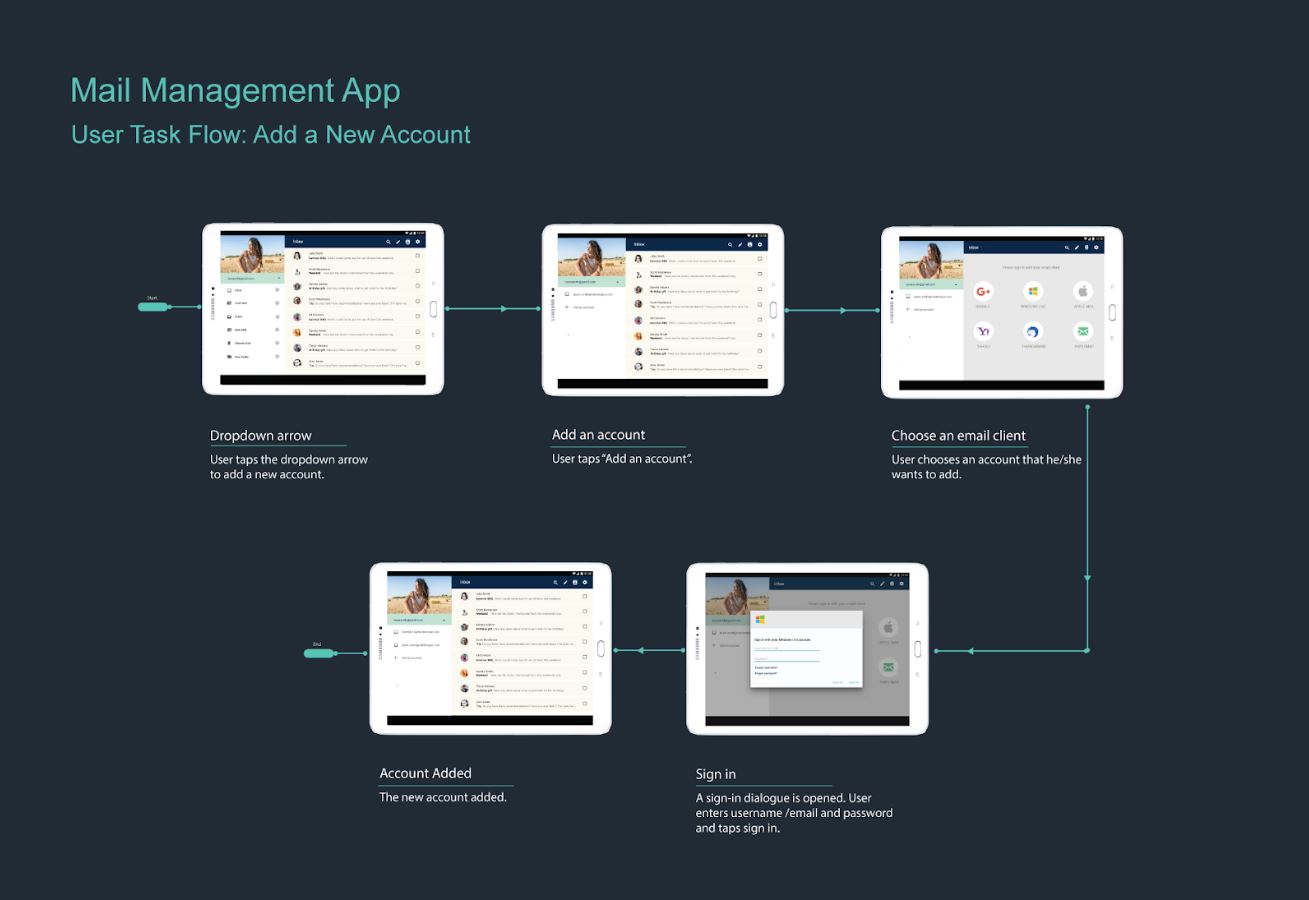
Add Account
There was also a feature that would allow the inboxes to be compiled or viewed separately.
Sign in
This is the lo-fi version of the sign in screen. Not much change here yet.
Inbox
A few changes were made to the inbox. We maintained the sidebar but made the profile picture stand out at the top in a circle. Notice the dropdown in the blue box? We moved the add account dropdown to be right under the profile picture to make it easy to find.
Add an Account
The add account was changed to fill up the left column.


Sign in
This high fidelity version of the Sign-in screen shows the different email clients the app would support.
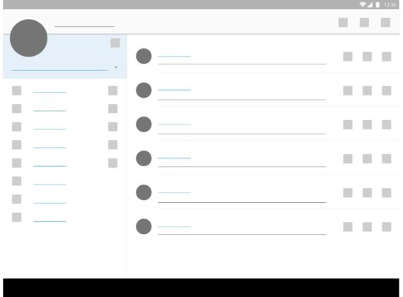
Inbox
The sidebar holds all the folders, profile and account adding features.
Add Account
This screen is similar to the sign in screen. The idea was to maintain the style across the function, whether its the first-time sign in or adding multiple accounts.
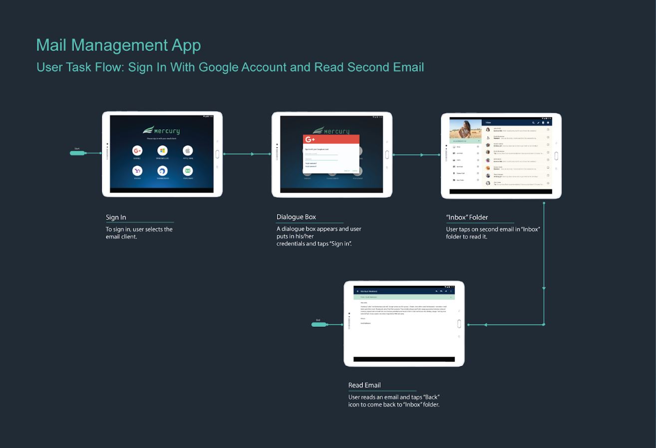
Prototype
We made the prototype using UXpin. The tool allowed us to play around with transitions states, and animations.