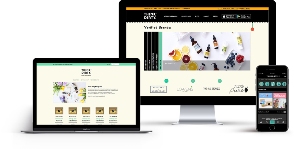
Think Dirty App
Multimedia design and development including app interface design, motion design, and front-end development.
My Role
Think Dirty is a clean beauty app that allows you to scan personal care products to discover if they rate as “clean” or “dirty”, based on their ingredient information.
Think Dirty is currently made up of a small team. Being the only designer on the team, my work involved:
- user experience and user interface design for their mobile iOS and Android app;
- front-end development and website maintenance;
- Shopify website set-up and maintenance;
- graphic Design;
- photography and video editing;
Goals
The main goal at Think Dirty were to create an experience that would drive user engagement. The experience had to be usable and seamless throughout all its different channels. The goals were to make the user feel empowered by the information they got from the application, and to inspire the user to switch to "clean" make-up.
iOS and Android App Design.
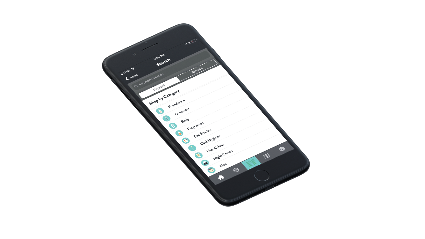
I designed several updates for the application. One of them, the "Shop by Category" feature, was recently released in the 4.0.0 version of the application. This feature allows the user to filter and find "clean" products by using the categories already assigned to each product in the Think Dirty database. The purpose is to drive engagement and make it easy for the user to search and shop on the app.
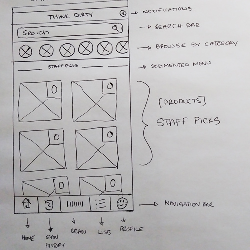
I used both paper wireframes, Illustrator, and Adobe XD in the design process.
Methodology
The best source of information we had available were app reviews. I went through hundreds of reviews, on Google Play and Apple Store.
Findings
From these reviews, I was able to sort out the pain points users had with the app, and some features that they wanted to see in the app.
Some of these included:
- A better searching experience that included searching by product category and brand filters;
- Browsing products by categories.
- The ability to leave reviews.
One of the first tasks I took on was redesigning the iOS and Android Home Screens. There were several new features that were to be added in the redesign including:
- a feature that allows the user to browse products by category;
- a new layout for the home screen that would allow the Think Dirty to add more content such as product collections, brand profiles, best-rated product lists, etc.
Other features I designed included the search interface and the product review feature.
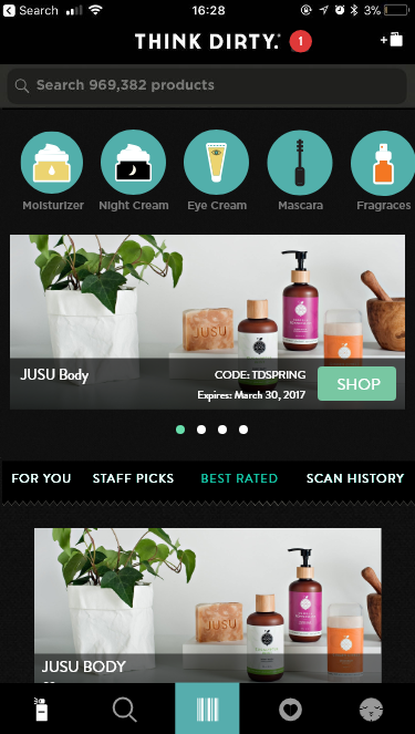
Trending Now
The "Trending Now" section already existed in the original app. It's a section where collections of products are posted for the user. The current layout is a horizontal-scroll style drawer. The new design proposes to convert it into a full screen (vertical scroll) by making it a part of a segmented menu.
Staff Picks
The "Staff Picks" section would be a new section where the Think Dirty Staff can recommend products they love. It's the second item in the proposed segmented menu layout.
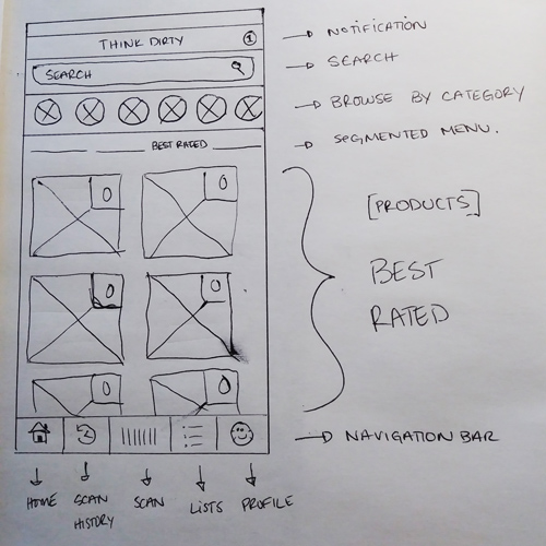
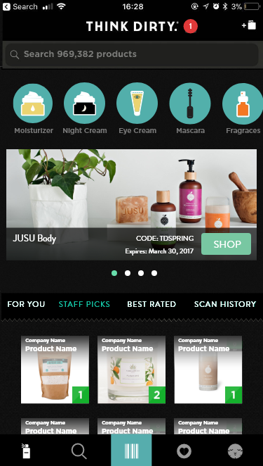
Best Rated
The "Best Rated" section would be a new section where products that are best rated in the app are featured. It's the third item in the proposed segmented menu layout.
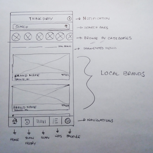
Local Brands
The "Local Brands" section would be a new section where we feature the profile of the brands that are from the same location as the user. It's the last item in the proposed segmented menu layout.
The design was made in Adobe XD. It went through many iterations. Some of the navigation and segmented menu items were changed in the process. Some of there changes were made to the Navigation bar and the Segmented menu.
Navigation Bar
Product Icon
The idea to change the home icon to a product icon stemmed from the main functionality of the page, which was to both suggest, showcase and promote clean products and brands.
Search Icon
The suggestion in this app concept design was that the navigation would be changed to include a search button page, which would contain a search bar, to search by typing a product name, brand name or UPC number - and at a later version - by ingredient. It was also to host a "search by category" feature, where the user could browse for products from a particular category.
Likes Icon
The liked icon was a screen dedicated to showing the user's liked products and was meant to include the "lists" section, where the user could sort products into lists such as "My Bathroom Shelf", "Wish List" or any other custom list.
Segmented Menu
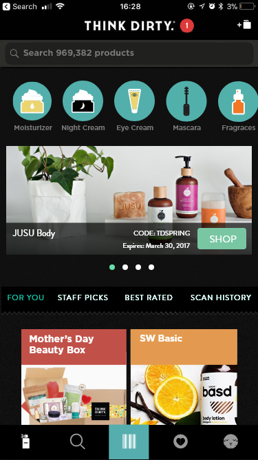
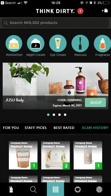
For You
This replaced the "Trending Now" section. It's a section where suggested collections of products are posted for the user.
Staff Picks
The "Staff Picks" product section stayed the same.
Best Rated
The "Best Rated" section concept changed from best-rated products to best-rated brands. This changed was made to promote clean brands that were rated by the how clean and how well rated they were by users.
Scan History
The "Local Brands" section would be replaced by a recently viewed and scan history screen, where a user can easily access products they have viewed or scanned before.
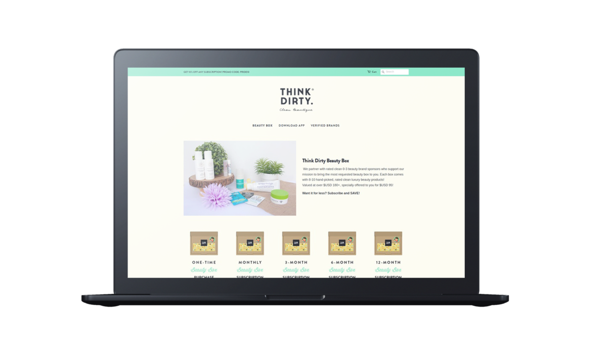
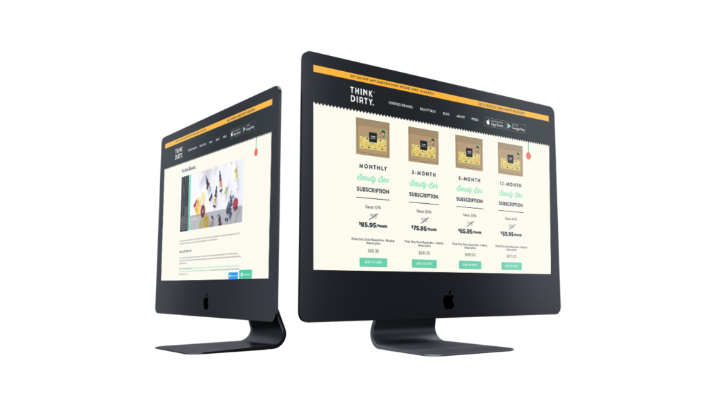
Shopify storefront.
When I was asked to set up a Shopify storefront, I was very excited. The goal was to increase sales from the Think Dirty Beauty Box by setting up a subscription service. It was my first time using this e-commerce platform, and I really enjoyed the process of setting up this shop. I learned some liquid basics and used my Sass skills to modify a Shopify theme.
As a result, sales and affiliate link revenue increased.
Maintaining and updating
the website.
A large part of my job consisted on updating, maintaining and adding sections to the official Think Dirty website.
I took care of front-end development using HTML5, CSS, jQuery, JSON and PHP. I simplified the legacy code by using PHP templates; and created pages for verified brands, updating press and marketing sections regularly.
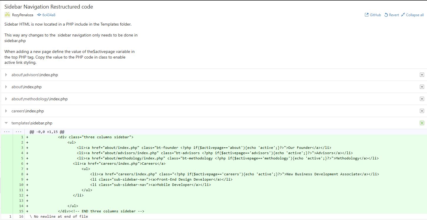
An example of something I accomplished while being in charge of Think Dirty's website was making navigations more efficient. When I started to work with this website, I was working with a lot of legacy code. Some of the code was repetitive, such as the sidebar code for the pages under the about and press navigations. Each page that was linked in that navigation system had its own sidebar code snippet. Every time a page was added I would have had to go to each page and add the code for that page. This was time-consuming, especially in an environment where I was the only designer and front-end developer.
The solution to this problem was to restructure the sidebar navigation code in order to make it more efficient.
The way to do this was to create a new PHP file that would host the sidebar code and be included in all of the pages in that menu. I deleted the sidebar code of each page and replaced it with the PHP include.

In order to show which page was active, I added a unique Page ID to each page and included a code snippet in the sidebar code that would recognize which page was active page by its Page ID.
An easy sidebar with no hassle
Now everytime a development intern needs to add a page to this menu all they have to do is add a page ID and modify only one document.